


![How To Master Orderflow [Orderbook, Liquidity, Market Structure, etc.]](https://taquant-content.s3.eu-north-1.amazonaws.com/books/how-to-master-orderflow-orderbook-liquidity-market-structure-etc/1774849369906-Screenshot_30-3-2026_13327_.jpeg)
HOW TO MASTER ORDERFLOW
Written by SoulzBTC
ORDER BOOK
The order book is one of the most fundamental tools in trading. It records all the buy and sell orders that traders place at different price levels. By reading the order book, you can see where market participants are willing to buy, where they want to sell, and how much volume is waiting at each level.
It is not just a list of numbers. It is a real-time snapshot of supply and demand that reveals liquidity, market sentiment, and potential turning points.
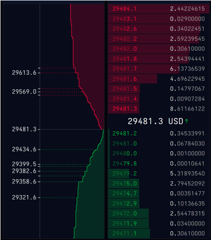
What is an order book?
An order book for any asset, whether it is Bitcoin, Ethereum, or a stock, displays all outstanding limit orders. The bid side shows the buyers and the prices they are willing to pay. The ask side shows the sellers and the prices they want to receive.
Key terms to remember:
- Bid: The highest price a buyer is willing to pay.
- Ask: The lowest price a seller is willing to accept.
- Spread: The difference between the best bid and the best ask.
- Order wall: A large cluster of buy or sell orders at a specific price.
- Liquidity gap: A price zone with few orders, where price can move quickly.
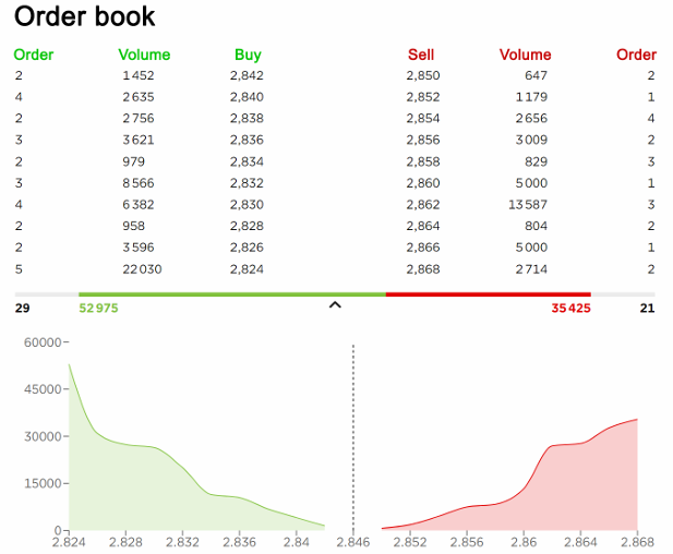
How the order book works
When a new buy limit order is placed, it gets added to the bid side. When a sell limit order is placed, it goes to the ask side. Orders are arranged by price and time priority.
- On the bid side, the highest bids appear at the top.
- On the ask side, the lowest asks appear at the top.
Whenever a market order is placed, it executes against the best available order on the opposite side. After that trade, the order book updates instantly to reflect the new balance of buyers and sellers.
What traders should look for
The order book reveals three main characteristics of a market:
Market Spread
- ● Difference between best bid and best ask
- ● Narrow spread = high liquidity
- ● Wide spread = low liquidity
Market Depth
- ● Amount of buy and sell orders at each level
- ● Deep book = strong liquidity
- ● Shallow book = volatile price moves
Market Balance
- ● More bids stacked = stronger demand
- ● More asks stacked = stronger supply
- ● Maker walls act as magnets, but outcome depends on supply vs demand
When is it bullish?
What to look for:
- ● Large buy walls sitting under price attract taker buys and provide support
- ● Weak sell walls above price that get absorbed quickly
- ● Buyers stepping in repeatedly at the same level, reducing downside follow-through
When is it bearish?
What to look for:
- ● Large sell walls sitting above price that absorb taker buys and act as resistance
- ● Bid liquidity thinning out under price while sellers continue hitting the bid
- ● Sellers stepping in heavily at range highs or after rejection wicks
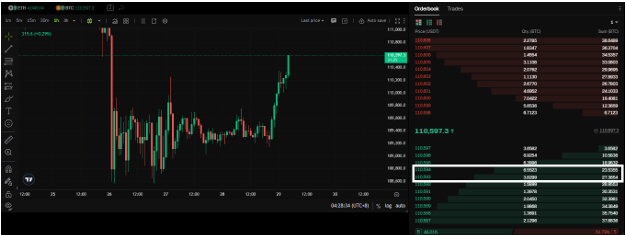
Live Example:
Bullish:
This is just a simple example, but it shows how to read the order book in real time. Look at the highlighted box in the screenshot. Notice the large quantity stacked at those prices. If price dips into that level, there is a high chance it will hold instead of breaking lower. Of course, this always depends on the situation, but it demonstrates how order book liquidity can act as support.
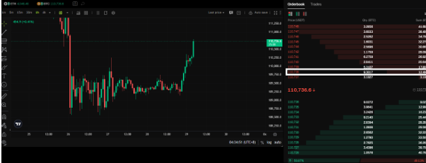
Bearish:
Now for the bearish example. This is also a simple case to illustrate how the order book can signal resistance. In the screenshot, look at the highlighted box. There is a large quantity stacked at that price level. When price pushes into that area, it will likely react and struggle to move higher. This is the mirror image of the bullish scenario, where instead of support holding price up, heavy sell orders create a ceiling.
VOLUME PROFILE
Volume Profile shows where the most trading activity occurred at each price level. Instead of looking at volume by time, it looks at volume by price. This gives you a map of where traders consider fair value and where the market rejects price.
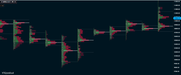
Key concepts
- ● Point of Control (POC): The single price level with the highest traded volume.
- ● High Volume Node (HVN): An area of heavy trading activity that acts as strong support or resistance.
- ● Low Volume Node (LVN): A thin area with little trading activity where price tends to move quickly through.
- ● Value Area: The price range that contains about 70 percent of volume traded.
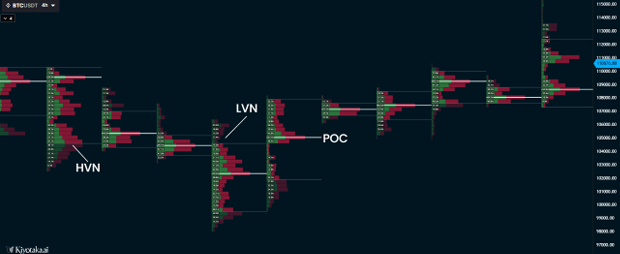
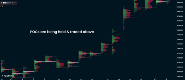
When is it bullish?
What to look for:
- ● Price bouncing off the POC and holding above.
- ● Rejection of LVNs to the downside followed by strong recovery.
When is it bearish?
What to look for:
- ● Price failing to hold above POC and falling back into lower levels.
- ● Rejection at value area high.
- ● Movement through an LVN to the downside without resistance.
Volume Profile vs. Footprints
Volume Profile maps out where trading activity took place by showing the total volume at each price level. It highlights areas such as the Point of Control, high volume nodes, and low volume nodes, which often act as support or resistance. This makes it a great tool for identifying value zones and understanding where the market has accepted or rejected price.
Footprint charts go one layer deeper by showing how that volume was executed inside each candle. They break down trades into buys hitting the ask and sells hitting the bid, revealing which side was more aggressive at a given level. In short, Volume Profile shows where the market was active, while Footprints show who had control at those prices.
LIQUIDATION HEATMAP
The liquidation heatmap tracks where traders who use leverage will be forced to close positions. These zones act like magnets because once price gets close, the cascade of liquidations can accelerate the move.
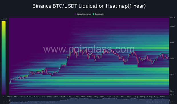
How to interpret the heatmap
- ● Bright clusters: Areas with a high concentration of liquidations.
- ● Long liquidation zones: Below price, showing where overleveraged longs could get closed.
- ● Short liquidation zones: Above price, showing where overleveraged shorts could get squeezed.
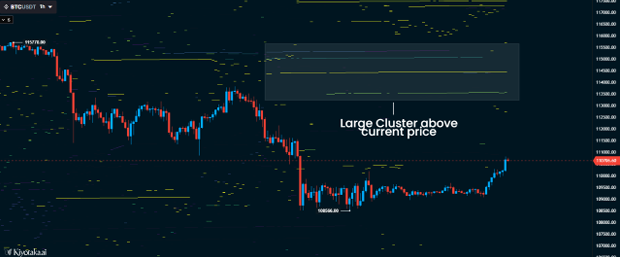
When is it bullish?
What to look for:
- ● Large cluster of short liquidations above current price.
- ● Price grinding upward toward those clusters.
- ● Squeezes triggering rapid moves above as shorts get forced out.
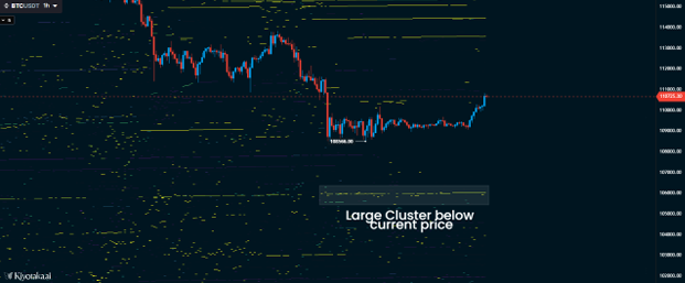
When is it bearish?
What to look for:
- ● Heavy clusters of long liquidations stacked below price.
- ● Market drifting lower with weak bounces.
- ● Big red candles as longs are wiped out.
Trading Takeaway
The liquidation heatmap is ultimately about identifying trader pain. Most retail traders misuse leverage, placing positions too close to obvious levels, and end up getting liquidated in clusters. These areas act like magnets because the market often seeks out liquidity to fuel the next move.
By tracking where liquidations are stacked, you gain insight into potential targets. A cluster of short liquidations above price can trigger a squeeze when buyers force shorts to cover, driving price higher. A cluster of long liquidations below price can create a cascade as longs get forced out, accelerating a selloff.
This tool should not be used in isolation, but when paired with order flow or volume analysis it can help explain why price moves so sharply at certain levels. Understanding where traders are most vulnerable allows you to anticipate where the next expansion might occur and prepare to trade with the flow, rather than against it.